Gene Markopoulos
A BRIEF LOOK AT ANGELO EVELYNS WEATHER KEYS
As a meteorological officer trainee, on a Canadian air
base in Ontario, Angelo Evelyn has been drawing weather maps
as early as 1968. At the time, they prompted his superior officer to remark
that they looked more like art works. It did not take long for Angelo Evelyn
to quit the armed forces and become a painter. With the prints that
form the Weather Maps series, he has come back to the artistic analysis
of forces that affect todays world, and certainly not only in ecological
terms
The bulk of the work that was shown in the Hilversum exhibition
of Weather Keys was constituted by prints from the Keys to Global Warming
series done in 1998.
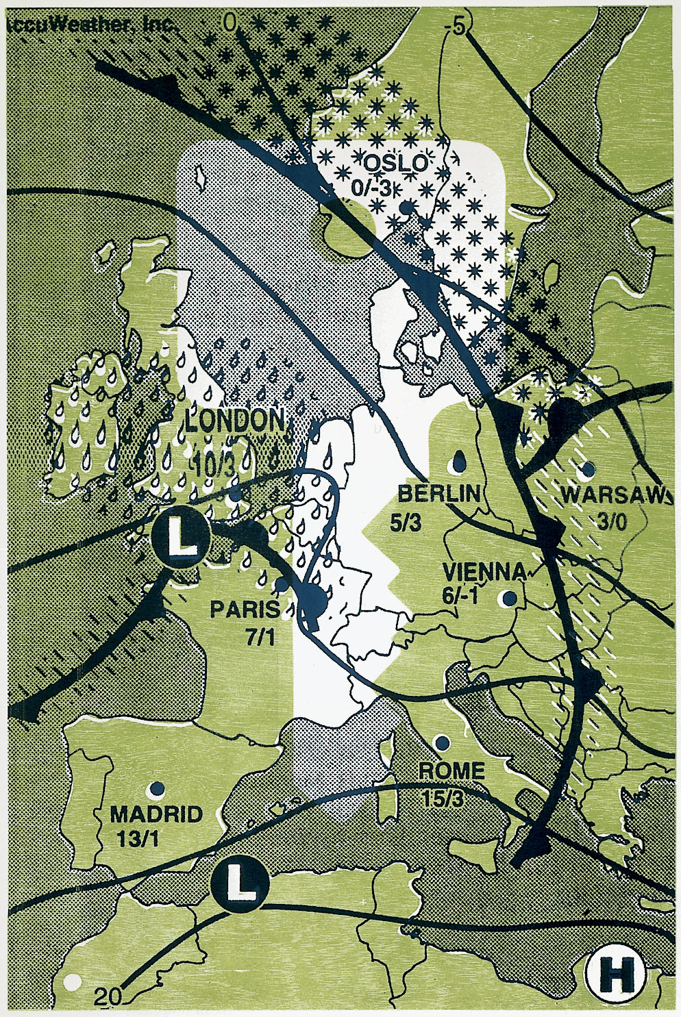
Also included were thematically related works, like Snowing
in Edmonton, Sunny in Madrid, Wind-Chill in Sapporo, etc.
If we look here, briefly, at the Keys to Global Warming
series, the reference to a central issue of the conferences in Kyoto, Montréal,
and Rio de Janeiro on global weather patterns and disruptive changes wrought
by man-made factors is apparent.
As is obvious, the elementary visual material serving
as the basis of the works shown in the Hilversum exhibition has its origin
in contemporary popular [or everyday] culture . (In Germany where the
artist lived and worked for several years, they have an apt term for it,
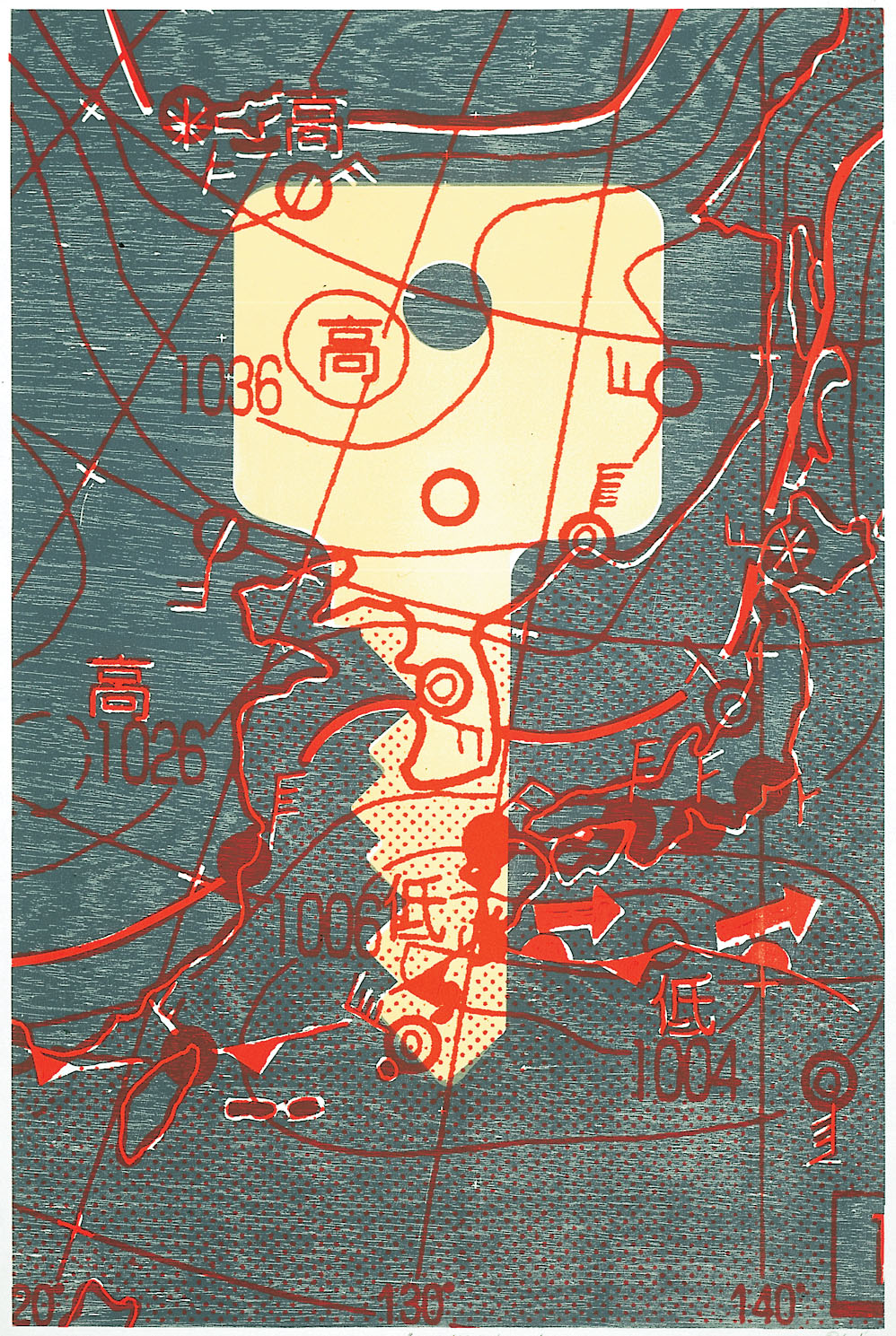
Alltagskultur.) For one thing, there are the small weather maps cut from
newspapers of three major cities (Tokyo, Montréal, and London) that
served as a starting point, being blown up to considerable size. Then,
there are the car keys, blown up as well to extra-large size, that figure
prominently on top of the maps. Locked into them are the logos of
car companies. The conventional symbols of weather maps mingle with these
logos, but even more strikingly with the rubbed-off imprints of Asian,
American, or European coins: objets trouvés as much as collective
symbols that ask to be deciphered, they seem to be falling from heaven
like snow-flakes
The effect is a striking combination of popular icons
which can be read visually in various ways, depending on the type or category
of reader or spectator involved.
Basically, a symbolic reading is suggested that in some
way or other succeeds to connect the different elements or layers incorporated
in each work. The simplistic newspaper weather maps that at the outset
were mere, recognizable representations of a corner of the world (East
Asia, North America, Europe, three centers of polluting industries) have
been transformed into something more complex and thus less likely
to trigger a clear and easy, one-dimensional interpretation.
The, by and large, fairly controlled build-up of dynamic
visual elements of each work leaves us with specific impressions, faintly
remindful at times (in its cool elegance and the timbre of colors chosen)
of classical Japanese prints of the 18th or early 19th century. This is
especially true of Keys to Global Warming, N. America; Keys to Global Warming,
Europe II, Keys to Global Warming, E. Asia (all measuring 110 x 75 cm).
Other works, like Keys to Global Warming, Europe and
Keys to Global Warming, East Asia (both 56 x 76 cm), show a more dramatic
quality that results in almost landscape-like impressions.
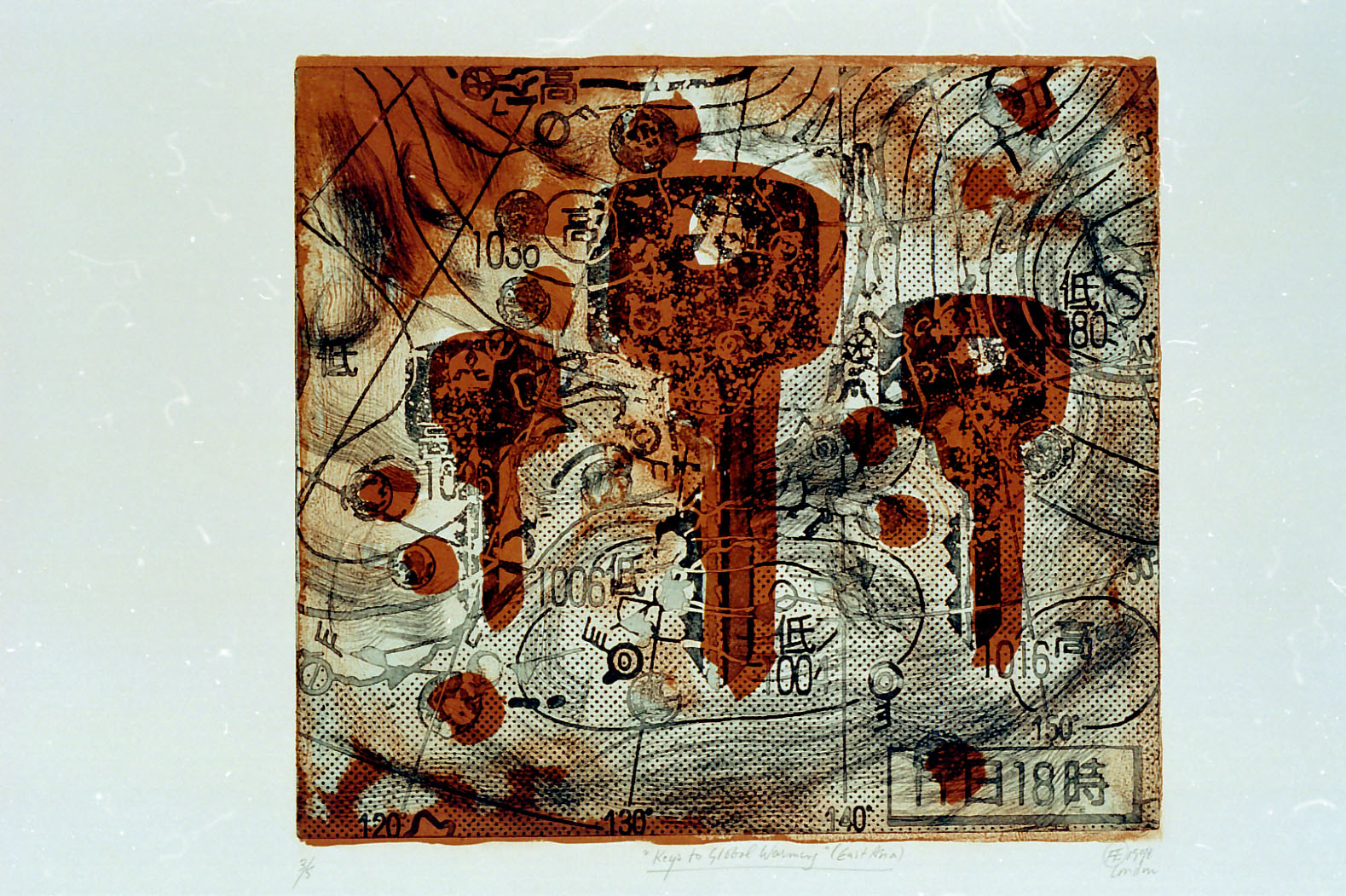
These may, in effect, be linked with (or give rise to)
associations that are perhaps suggestive of recent turmoil of weather patterns,
irregularities, even catastrophes.
The superimposed keys recurring in all of these works,
as a single key in the center or a group of three keys, are an important
structural element. Their combination with the weather maps is in fact
tantamount to a montage. A far-eastern aesthetic technique, at the outset.
Which, as Fenollosa and Eisenstein knew so well already (decades ago),
can lead us to a flash of sudden insight.
The keys often seem cool and, like the coins included
in the last two works mentioned here, they seem also symbolic of a system
of production. Are they indicative of the threatening impact of this system
churning out endless products, mindless of the consequences? Do the coins,
as well as the standardized keys, point to the commodification of all aspects
of reality? In what way are the keys a half-hidden answer, a key
helping the viewer to search for an understanding of the problem of global
warming?
And what effect does the layering of each work, its method
of combining different types of basic elements (thus of layers that we
can identify), have on our way of reading these prints, in a way that is
as creative and self-guided as possible?
What is, finally, instilled, in the reader, by his becoming
aware of, and digesting of, the distinct hues of colors applied, the
specific texture of each work?
In the end, it is the viewer himself who can and might
answer these questions. Questions which are suggested or posed if
not pre-formulated by works of a striking beauty that may well result
from their intriguing combination of very basic elements. Elements, we
may well remember, that are snatched from among the most banal things
of our everyday lives.
Go to ART IN
SOCIETY # 2 (contents) |