Luc Coeckelberghs: A Belgian Artist
Exploring Space and Its Interaction with Color
His recent paintings that add
canvas upon canvas or ‘hover’ above the wall, are never ‘clean,’ ‘cold’
and ‘pure’
As I enter Luc Coeckelberghs’ studio,
I see three small paintings that immediately capture my imagination. The
first one has a geometric shape but it is neither a rhombus nor a rectangle.
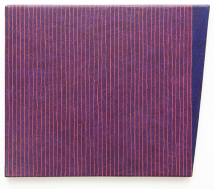
Untitled (2003), acryl on paper
on panel, 21,6 x 24,9 cm
Looking at it, my eyes are drawn
to what appears like, very nearly, a square that is traversed by
warm red lines running down vertically, next to each other, leaving space
for thin, violet stripes of color. But then, a narrow, elongated triangle
seems to be ‘added’ next to this almost square-shaped, warmly violet rectangle.
It is pointing towards the ground. A certain blue with a tinge of violet
colors this triangular part of the work. And stepping closer, I recognize
that it is also the color of the vertical stripes in the almost square-shaped
part of the painting. But there, it appears to me as more ‘violet,’ apparently
because of the inserted, red lines. The fact that the surface color of
the entire work appears in its purity in the triangular part to the right
of the larger, almost ‘square-shaped’ section, whereas it is affected by
the presence of the horizontal lines in the latter, makes me curiously
aware of the interaction of color. The subjective perception of color is
affected by it, especially if I don’t approach the canvas very closely.
I also notice how the very fact that the small canvas is not a rectangle
brings a certain, dynamic quality to the work.
* *
*
The next painting does something
of the sort, again. There is a square-like middle part of the painting,
and blue stripes of color stand out in it because this blue part is traversed
by thin, red, vertically oriented ‘threads’ or ‘traces’ of color. To speak
of lines would be too much, too inaccurate. The abstract purity of thin,
completely straight geometric lines of an exact and equal width has been
avoided.
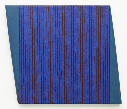
Untitled (2003), acryl on paper on panel, 21,6 x 26 cm
These trickles of red color running
down vertically, leaving a thin trace, obviously have not only produced
the effect of blue bands or stripes of color that are left where the red
trickles did not cover the blue of the surface. They have also affected
the color pecerption with respect to these blue stripes, creating an overall
impression of a strange, warm blue crossed by these reddish threads.
Both to the right and left of the
central, almost square-shaped part of the painting, a triangle executed
in a beautiful turquoise color has been added. The two triangular sections
are of exactly the same size and they are obviously characterized by their
‘sharp,’ acute angle. A nearly square-shaped center, with a triangular
addition on either side produces of course a sense of harmony, of equilibrium,
both in terms of the distribution of visual forms and of colors.
But the existence of the two triangles also brings a dynamics into the
painting, especially insofar as one triangle points to the sky, the other
to the ground. The overall shape of the painting thus appears as that of
a rhombus. The shape chosen for the canvas challenges the idea that paintings
have to be square or rectangular.
* *
*
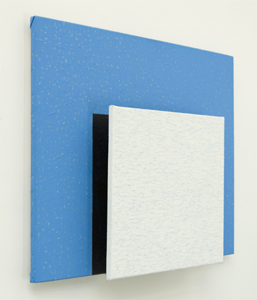
The third work is a small but enchanting
one, too. It is elongated; it is oriented vertically; the shape is obviously
geometric, but complex, perplexing. Three panels, each one smaller than
the preceding one, have been mounted on top of each other.* Of course,
we see only a bit of the bottom one to the right and left of the other
two. We see its Prussian blue in all its intensity. On top of it
is the black canvas, and again on top of this, the light blue one. Watching
closely I notice that the blue incorporates a faint trace of turquoise.
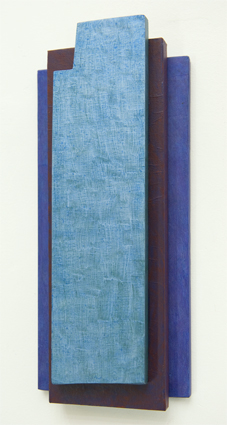
Untitled (2000), acryl on paper on panel, 35,2
x 18,8 cm
The way in which these panels overlap
and the fact that we see the ‘thickness’ of each one of them, all add to
our impression that we perceive a material, corporal object – three-dimensional,
by all means, and not just a composition of colors present as a plane surface.
This impression is even more present when we notice the colored sides
or edges of each canvas as we look
at the work a little bit from the left or right.
As always, the texture of the surfaces
matters a lot for the artist who has produced this work. It is rich and
sensuous. The effect is that what Luc Coeckelberghs has created is not
at all a sparse, minimalistic work. It is not tending towards abstraction
but embracing a love for the concrete. What I see is a three-dimensional
object of great beauty.
* *
*
I remember that as a child, I took
a rectangular piece of wood, putting nails in it with a hammer which I
would then connect with thread my grandmother used for sewing. I spent
hours that way, constructing my imaginary ocean-going vessel, a ship or
raft? It was never clear what it might finally become.
Luc Coeckelberghs, a painter
whose works somestimes become, in a way, three-dimensional and thus sculptural,
has created an object that breathes the freedom I found in the imagination-driven
creation of my childhood days.
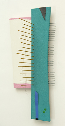
Untitled (1985), acryl on paper on panel, 62
x 29 x 25,2 cm
copper wire, wooden sticks, aluminium, lead
Working on wood, and applying a
monochrome green verging on turquoise to it, he has again succeeded to
give his work a rich surface texture. The piece of wood is elongated. Neither
the long nor the short sides of it are running in parallel fashion.
The idea of a rectangular work of art is abandoned, it is contradicted
in fact. But working on wood nearly as thick as a finger, and
being intent to create a texture of color that is palpable, the idea of
the plane, thin surface painted on that is so inherent in works on paper
and that even works on canvas remain by and large attached to, is also
opposed.
On the green board with its slightly
curved, frontal bottom edge, two green, thick “dots” of color have
been applied. To the left, an elongated piece of monochrome blue textile
covers part of the board; a small part of this tape-like or ribbon-like
textile is black, however. I think that it is probably the original black
of the tape which has then been partially overpainted in blue.
Counteracting perhaps the blue and
black tape, an elongated, triangular, once again black piece of material
appears in the opposite side of the green board. It is a thin layer
covering part of the turquoise-green surface.
The green piece of wooden board
rests on another finger-thick piece of wood. It is overpainted in a warm,
icecream-evoking tone of beige while an icecream-like ‘strawberry’
pink is applied at its margins. The line that separates the large field
of beige color in the center of this piece of wooden board from the pink
margins is not straight; quite on purpose it is left to follow its shaky,
almost random but not at all nervous course.
In horizontal fashion, grey metallic
‘needles’ of irregular but nonetheless similar length stick out from
the green board, suggesting something functional. They are 35 in all. Long,
thin metal objects. And the gaps between them remind me of keys of a piano
while the grey ‘needles’ remind me of the gaps between these keys.
Close to the edge of the green board
– an edge that forms the visual boundary between this board and the beige
and pink one – , light brown, thin ‘sticks’ spring up from the turquoise-green
surface. They are lined up in parallel fashion. They are of clearly very
unequal length, and they are connected by two lines of thin, dark metallic
thread. One piece of thread forms a curve reaching almost the bottom which
is the green board; another piece of thread, forming a nearly parallel
curve, sets out to do the same but then ends abruptly in mid-air.
The object thus constructed, made
up largely of two flat, painted pieces of wooden board that are attached
to each other while overlapping slighty, reveals what is also present in
other works of Luc Coeckelberghs that somehow still echo, to a greater
or lesser extent, traits of two-dimensional paintings. It shows a love
of monochrome colors and their combination, their relation; also a longing
for the concrete, as revealed by texture. But at the same time it is protruding
more clearly, still, into three-dimensional space. In this poetic,
very painterly object, the ‘needles’ and ‘sticks’ – the first protruding
horizontally from the work, the latter vertically – seem to emphasize
even more radically Luc Coeckelberghs’ quest to liberate painting not only
from the square or rectangular shape of more conventional paintings but
also from that basic two-dimensionality which is only timidly transcended
when, for instance, thicker layers of color are applied.
The poetic quality of this
object has much to do with its implicit rejection of functionality which
is so apparent exactly because the work is challenging the eye of the spectator
through the suggestion of (mock) functionality. But such poeticism in itself
is not new. It can be traced back to Schwitters and others, and re-emerged
later in some art works of the ‘60s.
* *
*
The blue square!, my eye (or was
it my imagination?) shouted. But it was not a square, of course; it was
a rectangle in intense blue, with a white square inserted into it.
Untitled (1992), acryl on canvas, 60 x 70 x 12 cm
The blue has the intensity of colors
I have seen in works by Helen Frankenthaler. The idea of pure geometric
forms goes back to Russian constructivists, of course, and to Josef Albers.
But the blue canvas hovers above the white wall in Luc’s studio, and this
is due to a wooden support below it that is about an inch thick and of
distinctly smaller dimensions than the rectangular panel which presents
its blue surface.
As for the white square that stands
out in front of the blue canvas, I notice that it is attached to the latter
by two metallic bows that keep it at a distance. Like the blue rectangular
canvas ‘hovers’ above the white wall, the white and square canvas ‘hovers’
about four inches above the blue one: a fact that is very palpable when
the viewer confronts the work.
Incidentally, stepping closer, I
see that the part of the ‘blue canvas’ that is visually underneath the
white square, is not blue at all. It has been painted starkly black.
If we stand in front of the work
in a way that lets us see it slightly from the left (or the right), we
will see a very thin, black, vertical rectangle separating the blue and
the white of the work. Cowering, we will see a slim, black horizontal line
between the whiteness and the blue, and also two broad stripes or bands
of metallic silver that reveal the presence of the two bows keeping apart
the white panel and the blue, while attaching the former to the latter.
The construction of this object
that is a painting existing on two levels & protruding so clearly into
space tells us a lot about Luc Coeckelberghs’s determination to free painting
of its conventional two-dimensionality. But such two-dimensionality is
also challenged by the texture created, a rich texture, not at all ‘minimal’
or ‘minimalistic.’ In this work, the artist executed the texture in extremely
painterly fashion by creating a wave-like pattern in that white square
which at a first glance seemed so abstract. I discover the repeated presence
of a very light, very pastose blue continually intermingling with the white
surface tone. Thick, tiny patches of such blue color, they are, next to
small patches of quite plane surface in white. And they remind me of myriads
of small fish swimming in a white ocean, or of small blue waves maybe,
covered by white crests. It’s a canvas worked on meticulously by the artist,
rich in detail when looked at closely but nevertheless suggesting whiteness
when standing further away. A whiteness, however, that is not abstract,
pure white, but rich and alive with the vibrations of its texture, its
uneven surface.
Conversely, the blue, rectangular,
almost square canvas we see “under” the white square, projecting to the
right and left side of it, as well as below and above it, is not as evenly
and abstractly blue as it seemed to be at first sight. It holds thick
patches of blue color inside, or rather on top, of its plane blue surface.
They are patches that again remind me of little fish springing in the water.
Silvergrey tiny patches of color are distributed at random across the blue
surface, as well.
Stepping away from the work, I sense
its three-dimensionality and now I also sense an almost pointillist presence
of white or silver in the blue space, and of light blue in the white square.**
A dialectical relationship between two colors present in three-dimensional
space results. The white seems present in the blue and the blue in the
white. Two abstract monochome colors inside two geometric spaces have come
to life; they have been transformed into two basically simple yet very
real, very intense colors. And this because they have absorbed their opposite
or ‘Other,’ the contrasting color that ‘opposes’ them, into their own realm,
without ceasing to be fundamentally ‘blue’ respectively ‘white.’
A work of great simplicity, that
is what it is indeed. But not as simple as our propensity to abstract,
to ‘look’ rather than ‘see’, may suggest.*** And certainly richer, in many
respects, and more intense than I could perceive in the very first moment.
* *
*
Joseph Albers taught some of us
to see colors, and to love their intensity, their specific presence, their
interrelationhip; all of this, we know, for its own sake. This has
never been easy to accept for those who want to speak about our time and
place, our world, our social reality, class society, class relations, class
struggle. But colors are also part of the world, this all but peaceful
and just and humane world we inhabit. And the sense of beauty in
us, or the loss of it, its withering away, are social facts. And so it
is revolutionary perhaps, in a certain respect, to re-kindle a sense of
beauty, the ability to perceive beauty that is so often neglected or suppressed,
aborted in fact, by rotten circumstances and sad neglect.
When he created the work I want
to speak about now, Luc Coeckelberghs composed an object – I must add,
a painterly object or object that is a three-dimensional painting –
by combining three basically monochrome canvasses, one mounted on
top of the other.
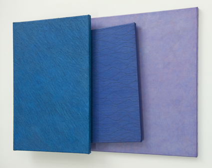
Untitled
(1992), acryl on canvas, 60 x 85 x 8,8 cm
The topmost canvas shows an intense
ocean green, the green of very clear, unperturbed waters on a sunny day.
It is a rectangle; it is mounted on the other two in a vertically way,
thus constituting what is called a vertical format.
But the pattern inscribed in the
texture of the color filling this monochrome green canvas runs, more or
less, in a diagonal direction. I add ‘more or less’ because there are these
‘deepenings’ next to ‘ridges,’ these ‘hollows’ in the texture produced
by the artist. They are traces of scratching that left long thin marks
of a somewhat lighter green-blue.And they do indeed produce the impression
of a diagonal pattern but nonetheless they don’t seem to run exactly parallel
to each other.
A certain sense of oscillation or
vibration is produced by this texture, by the multiplicity of scratched
marks, the traces of scratching quietly but determinedly, often in a way
that lets lines converge or cross each other. Blue-greens and darker blues
and light blues, in haphazard, random fashion, are engaged in an interplay.
The next layer of the work is constituted
by a canvas that is only partly visible: it protrudes in slightly diagonal
fashion from underneath the bluegreen, strictly vertical, rectangular canvas
while it is standing out, at the same time, in front of the third, horizontally
placed canvas.
This third canvas forms in a sense
a counterweight (if not counterpoint) to the horizontal canvas to the left
of it. It is a rectangle and, as I said, it has a horizontal rather
than vertical orientation. Its height is a bit less than that of
the blue-green vertical rectangle. And therefore, its upper edge is lower,
and its lower edge higher than that of the canvas to the left. Thus,
a somewhat irregular rather than rectangular, but nonetheless geometric
outline of the entire work composed of these three canvases results – an
outline that is composed of straight lines and eight corners, in all, which
are, in each case, encompassing an angle of 90 degrees.
The whole work appears as very balanced;
even the fact that, as a second layer, a diagonal canvas has been inserted,
does not disturb this balance: it adds a dynamic effect but it does not
unbalance the composition.
Having sketched rather briefly the
general composition of the work, it is time to turn back to the second
(slightly diagonal) canvas. It shows a basically dark blue color – at first
sight monochrome, just as the blue-green rectangle appears at first sight
as monochrome, and as the canvas forming the bottom layer of the work seems
to be at first sight monochrome, too. But the dark blue that is the basic
color of this slanted canvas is enriched by thin blue lines which
are running in almost parallel fashion next to each other. And even more
so, its tranquility that might have been discovered by the onlooker if
the line patterns had been lacking, is reduced if not aborted by
the very dynamic course of other, black lines that form a wave-like pattern
and that are considerably farther apart from each other than can be said
of the faintly visible blue lines. Also, like snow, tiny white dots appear
in the blue.
The texture of the last, violet
canvas, is the most regular one. Here we come closer to a truly monochrome
surface than in the other canvases forming the work. ‘Clouds’ of
reddish violet hazily merge with ‘clouds’ of a lighter, bluer violet. No
threads of black add a faint sense of ‘three-dimensional’ texture,
nor do scratches emphasize microscopic three-dimensionality, in the case
of this violet rectangle while its visible presence is somewhat overshadowed
by the diagonally intruding second panel.
The overall impression of the entire
‘object painting’ I have just discussed is one of dynamism, dynamization,
if you want. It is due, above all, to the protruding blue-green, vertical
panel that shatters the ‘rectangularity’ of the outline of the entire
work. And due also to the diagonally inserted second panel.
As a counterweight, the third and
thus bottom panel (visible to the right of the vertical one), provides
rest and a necessary measure of stability.
The apparent closeness of the main
colors (blue-green, in case of the first canvas, dark blue, in case of
the second, and violet, in case of the third) to something that we could
call ‘monochrome;’ counterbalances to my mind the observed dynamics, as
well, thus producing a sense of harmony, of serenity.
It is the texture of the surfaces,
especially in the case of the first two panels, that makes us aware that
this isn’t conceptual or minimalistic art tending towards the ‘clean’ and
abstract. But art made by an artist who is seeking to preserve the richness
of colors, and their material sensual presence. If his more recent paintings
have become constructions of more than one panel, constructions that reach
into three-dimensional space and that approach an object status that is
almost sculptural, this in turn confirms the impression that this is the
result of a quest for the ‘real,’ for ‘materially’ very present art,
for works that are never ‘clean,’ ‘cold’ and ‘pure’ and always richer in
texture and color than they appear to be at first sight. Perhaps it is
this quest which drives the artistic production of Luc Coeckelberghs in
his present phase of development.
(Sept. 2010)
FOOTNOTES
* The complexity of the work is not only to be
traced to the mere fact that three panels have been mounted on top of each
other. It is also a result of the size of each panel and the way these
panels have been mounted. And it is further increased by the outline or
shape of the uppermost panel. If we look at the way the panels have been
added, we find that the bottom one is a rectangle, wider than the other
panels. Above it is another rectangle, more narrow but higher and projecting
over the bottom and top edge of the panel below it. The uppermost panel
is the most narrow one of them all, and it even appears to be slimmer than
it is. While ts lower edge is situated above the lower edges of the other
two panels, its upper edge, being slimmer than the lower one,
projects over that of the panels beneath it. Given that the panel has left
and right sides that run straight and exactly vertical, how can the upper,
exactly horizontal side be shorter than the bottom, horizontal side?
The solution is that the rectangular shape of the uppermost panel
has been obstructed. It has five corners. And although four of its sides
run either horizontally or vertically, one, very short side, is slanted,
ascending very slightly, from the left to the right.
** I may have sensed it already before I stepped
up to the painted surfaces, but remained unaware of it, registering it
‘merely’ pre-consciously.
*** A brief look is of course enough to say, aha,
hm, yes I recognize it as a blue rectangle and a white square. Enough to
think of Albers, for instance. But as Viktor Šklovskij pointed out, recognition,
the brief look that lets us recognize may be the opposite of seeing, of
truly seeing.
The first amounts to automatized perception.
Art, if it challenges us to see, furthers the de-automatization of the
aesthetic perception process.
Perhaps such de-automatization of aesthetic
perception is a fundamental trait of all true art, whether “committed”
or “uncommitted.” This type of de-automatization may well be a prerequisite
for further and more far-reaching de-automatized cognition.
If we switch from the question of pure form,
which was so decisive for Russian formalists like Tynjanov, Ejchenbaum
and Šklovskij, and turn to that other, just as vital social need
to de-automatize the cognition of historically produced, changeable and
changing social relations, we arrive of course at Brecht’s conclusion that
“making the supposedly familiar look strange” is necessary if we are to
overcome engrained prejudices and preconceptions, in other words, the “dominating
mode of thinking” which reflects the positions (and thus class interest)
of the dominant social forces.
|